The logos are both created in Adobe Illustrator.
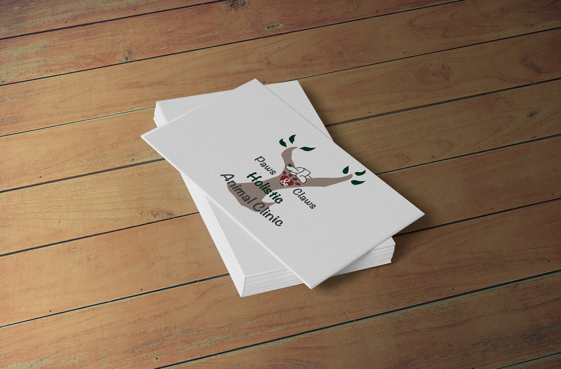
Paws & Claws was class project. I chose design brief for Paws & Claws Holistic Animal Clinic from a choice of 4 design briefs. They wanted a logo to reflect their business.
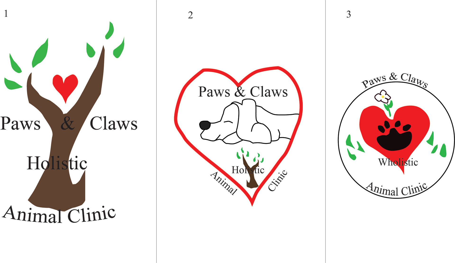
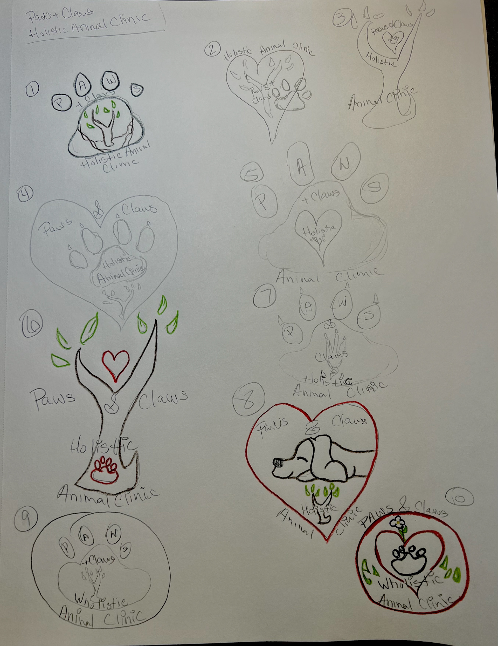
In research, I looked at a few other holistic designs. Most of them have nature and flower symbols. I looked at what a paw looks like and did a little picking at my dog's paws (she did not like it). I also looked at the symbols for other animal clinics. With the brief and my research, I created the sketches.
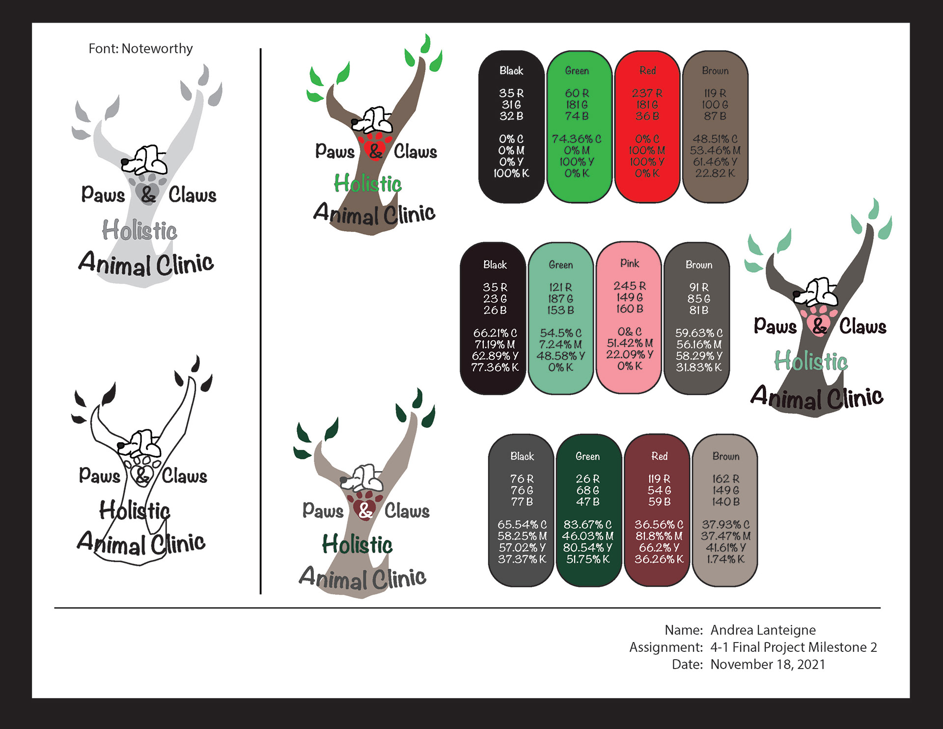
The logo I chose incorporates nature, animals, and has a feeling of a loved animal. For the font, I wanted it to be taken seriously, but not too seriously. I chose a fun, but business-like found called Noteworthy. It is easy to read and it isn't too uptight like Times New Roman, but it still gives the feeling that it is important and notable. For the font choices, I went with obvious— red for the heart/paw print, green for the leaves, and brown for the tree. I changed the color for holistic to make it stand out more as it was getting a little lost and now it is a central point of the design. I think the dog is a cute touch that will give the animal owner confidence that their animal will be cared for.
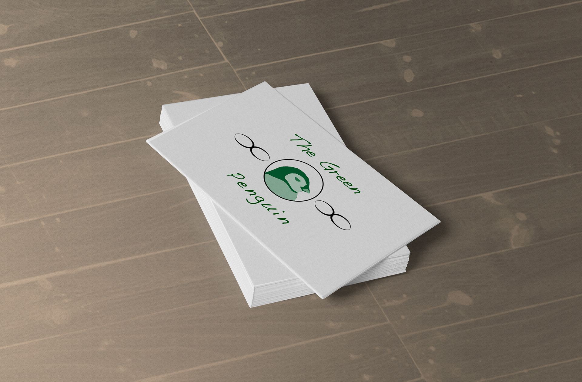
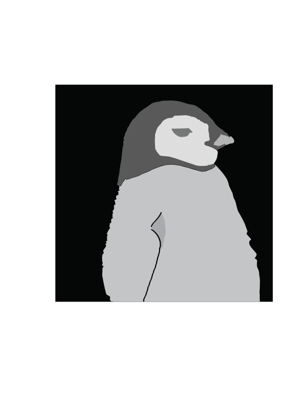
The Green Penguin was an idea a friend of mine had and I used her idea in a class project. I developed the logo in college. I had to pick an animal and create a logo with it. The animal we decided upon was a penguin as penguins are one of the animal most affected by global warming and it was fun to create in Adobe Illustrator. I went through a few different mockups including color, shape, design, and type.
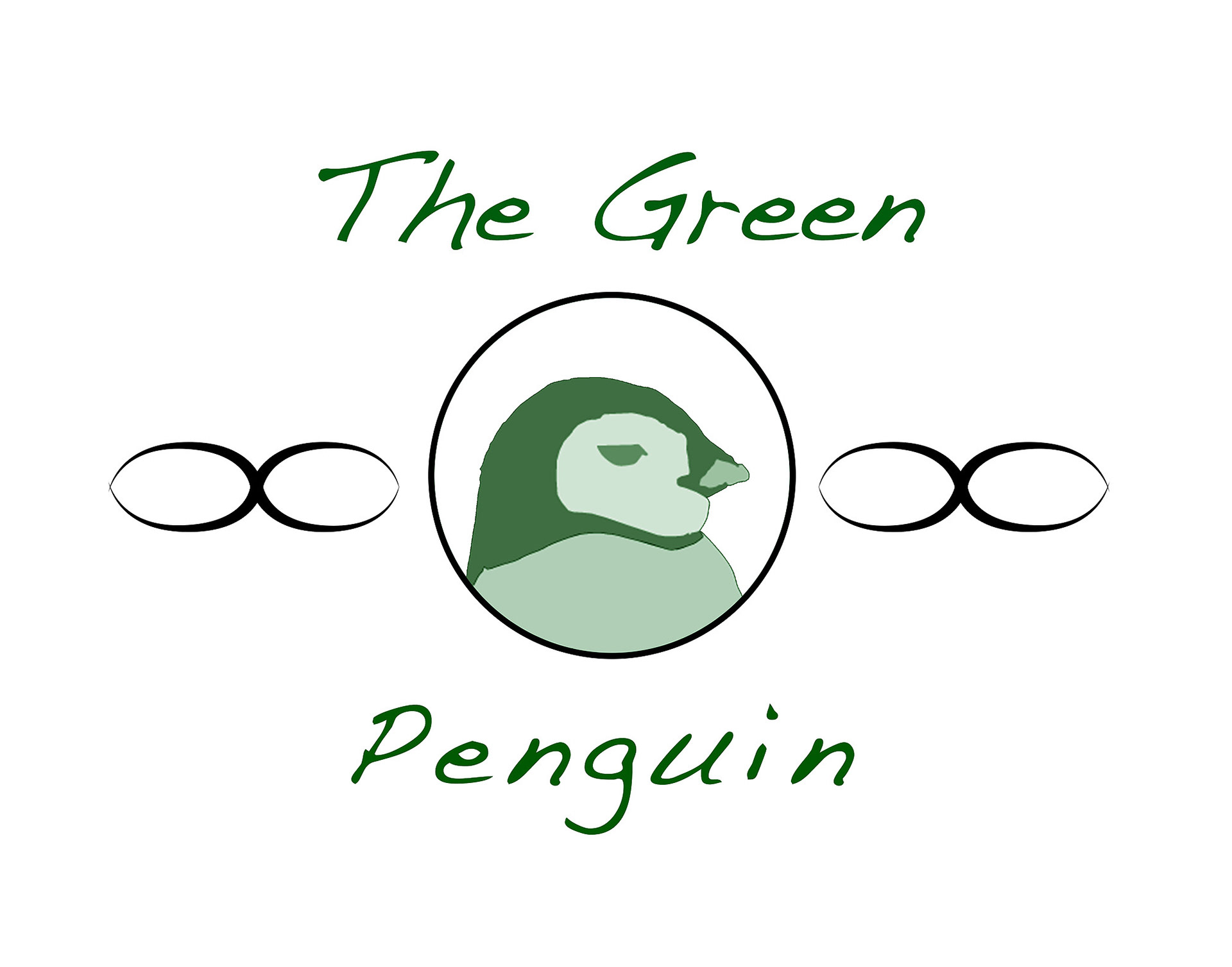
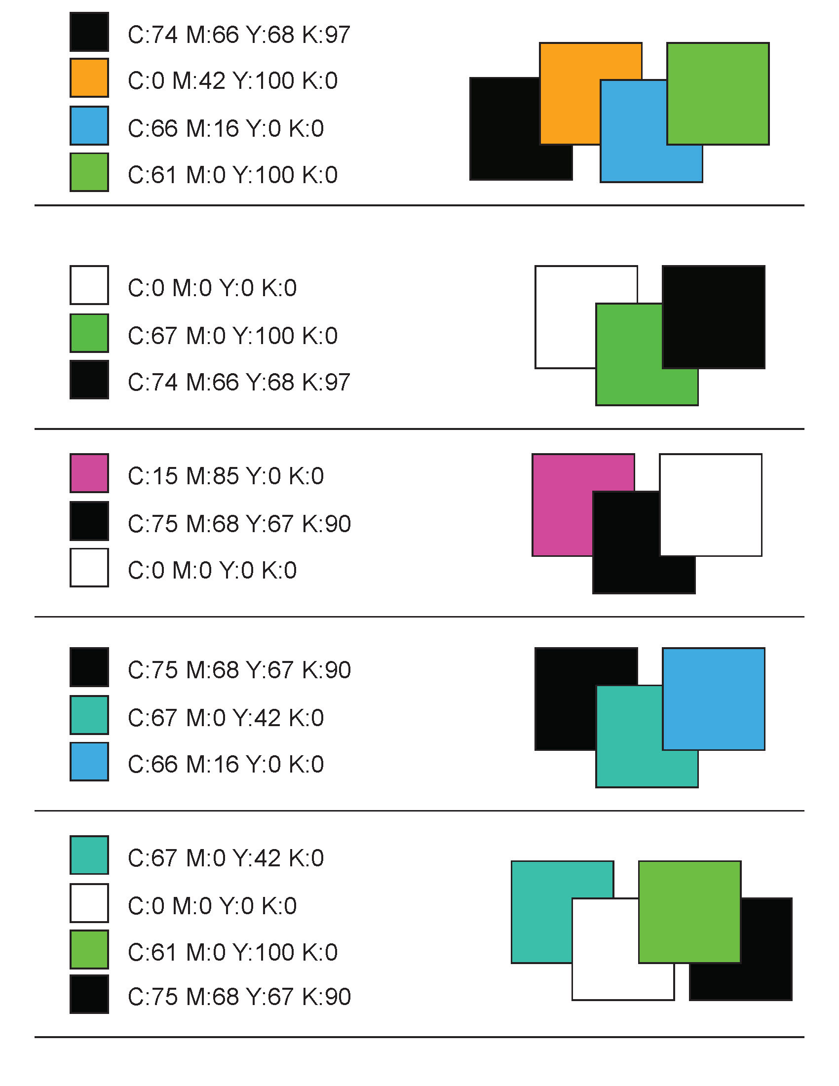
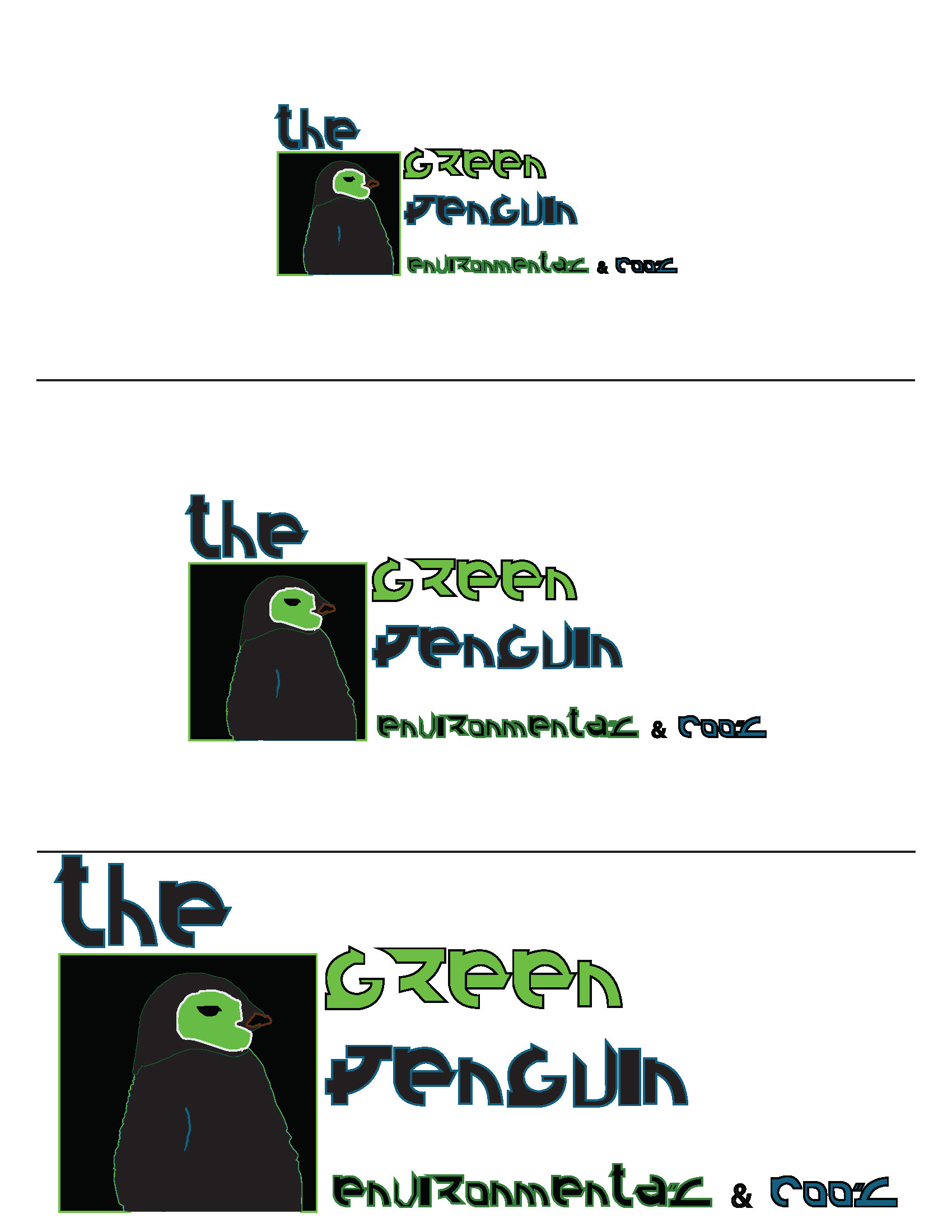

The logo on the left was ultimately chosen as it was elegant and could fit everywhere without taking up too much space. I also liked the triangle design for this logo as triangles are symbols for action.
Zap! was a prompt from one of my classes to create the following logo:
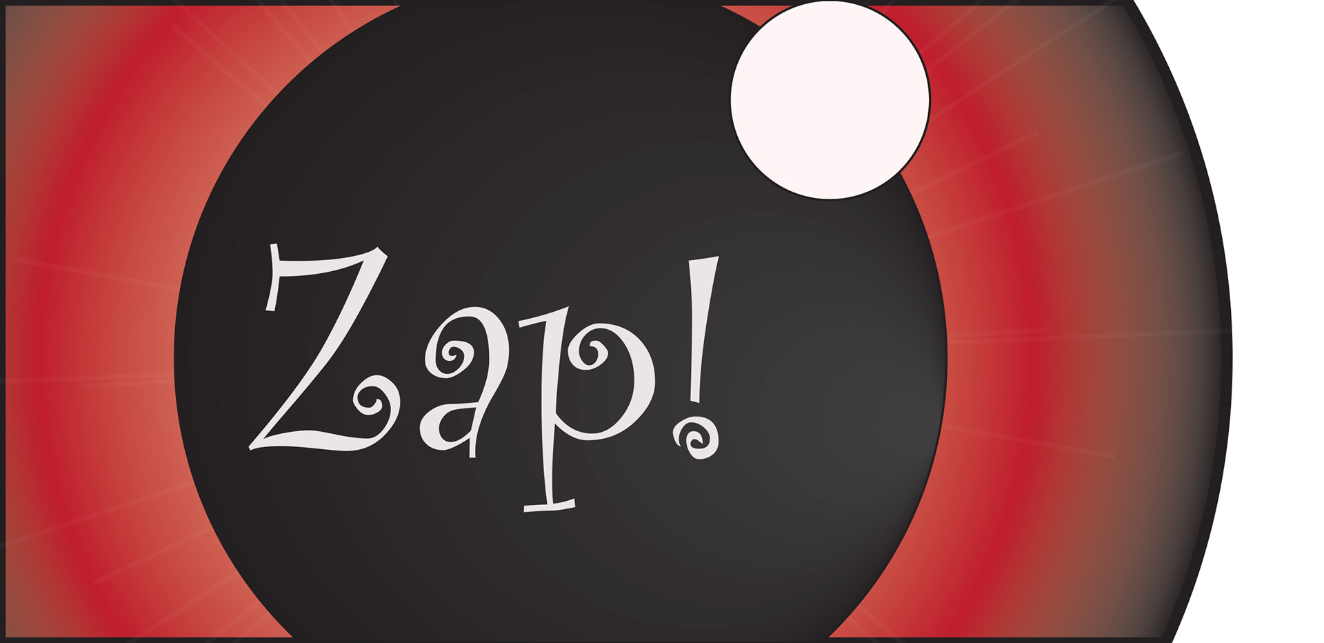
The ideas I came up with for the universal video game logo were centered around the word "universal". My two main ideas were that of an eye (on the left) and of a planet showing a universe (also on the left). As much as I enjoyed and I do love the logo on the left. It didn't really look like a logo to me. I chose the logo on the right as it was simple and would standout on a video game cartridge.